Homecoming Dress Colors 2026: The Trend-by-Trend Guide
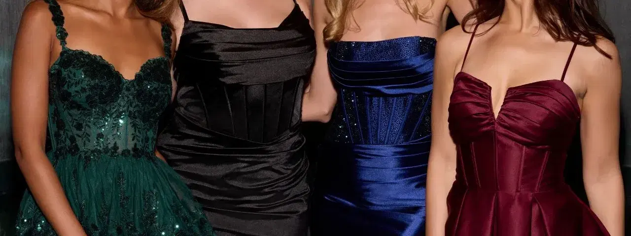
Every homecoming season has a color story, and 2026's is one of the most varied we've seen in years. You've got the shine-and-sparkle girls in cherry red and hot magenta. You've got the coquette-adjacent girls in butter yellow and blush. You've got the ones going full editorial in acid green and oxblood. And you've got the new energy this year—the girls in floor-length chocolate satin who look like they're at an art gallery opening. All of them at the same dance.
The 2026 HOCO color palette isn't one color or one trend. It's four distinct color stories tied to the four biggest trend pillars of the season—and every single one of them is going to be on your feed all fall. Here's the full breakdown, grouped by trend, so you can figure out which lane your homecoming color actually lives in.
Four trend pillars, four color stories:
Main Character Energy—high-impact color: cherry red, electric pink, cobalt, hot magenta, plus sparkle in silver, gold, and jewel-tone sequins
Modern Romance—soft and pastel: blush, butter yellow, lilac, mint, dusty rose, powder blue
Trendsetter Edit—bold and editorial: oxblood, wine, emerald, acid green, unexpected color combos
Minimalist Chic—rich neutrals: black, navy, chocolate, espresso
If you're skimming, this is your cheat sheet. If you want to actually figure out which color is yours, keep scrolling.
Main Character Energy is the loudest, most photogenic trend in the 2026 lineup—statement silhouettes, sparkle, corsetry, bodycon shapes, and the kind of color that shows up in every camera setting. Low-light phone flash, gym overhead fluorescents, parking lot golden hour: this palette photographs across all of them.
Cherry red—the It Color of pop-girl summer, and the one that's going to define red-carpet-energy HOCO photos
Electric pink and hot magenta—the shades that read "main character" the moment you walk into the gym
Cobalt blue—the loud blue, not the polite blue. Photographs like nothing else
Silver sequin—the classic sparkle move, and still the safest bet if you want a color-less color that still commands attention
Gold sequin—the warmer alternative to silver, especially good for warmer skin tones and fall-toned makeup
Who it's for: the girl whose Pinterest board is 30% Sabrina Carpenter red-carpet moments, 40% concert outfits from Zara Larsson, and 30% "things that catch every ceiling light." If your outfit's job is to make the comments section feral, you're a Main Character girl.
Modern Romance is the pastel-forward, coquette-influenced trend—soft florals, draping, lace details, bubble hems, ballet-inspired ribbons. The colors are the tonal equivalent of a sigh.
Blush pink—the palette anchor. Photographs beautifully in natural light and works across every skin tone
Butter yellow—the softer, warmer alternative to blush. The girl who wears butter yellow to homecoming is doing something right
Lilac—the pastel that reads slightly unexpected without leaving the Modern Romance lane
Mint and sage—the green side of the pastel spectrum, especially good with soft floral prints
Dusty rose—the moodier pink, more depth than blush, still fully in the romantic register
Powder blue—the pastel with the most "coastal fairy" energy, if that's the aesthetic you're going for
Who it's for: the girl whose Pinterest board is bows and ribbons and tiny florals, and who'd genuinely rather feel like the most romantic version of herself than the loudest one in the room.
The Trendsetter Edit is the trend for the girl who watches Paris Fashion Week recaps for fun and pulls TikTok aesthetic vocabulary out of thin air. The color story is bold, editorial, and often unexpected—the shades your friends are going to text you about.
Oxblood—the moody, dramatic red that reads more editorial than Main Character cherry
Wine and burgundy—the deep, jewel-toned reds that anchor the fall side of the palette
Emerald green—the polished, structured green (different from the softer Modern Romance mint)
Acid green and chartreuse—the loud, unexpected greens that photograph like nothing else. Not for the faint of heart
Unexpected color combos—color-blocking two shades that shouldn't work but do (think tangerine with hot pink, cobalt with oxblood, lilac with brown)
Who it's for: the girl who pre-shops the Vogue collection coverage, knows what Schiaparelli is, and would rather look like she’s in a magazine than a yearbook photo. Fashion-forward, opinionated, deeply personal. Her HOCO photo will be the one that ends up on someone's inspo board.
Honestly? The might be the one we’re most excited about. Minimalist Chic is for the girl who embraces understated style—clean lines, luxurious fabrics, structured silhouettes, timeless shapes. No sparkle required. The polished look comes from the fabric and the cut, not the embellishment.
Chocolate—warm, saturated, and satin-y. Reads more elevated than any other neutral, and photographs incredibly across every venue. Chocolate satin at homecoming is going to be everywhere
Espresso—chocolate's deeper, moodier sibling. Almost-black but with warmth. Reads especially luxe in satin and crepe
Black—the eternal minimalist move. Especially strong in a clean slip silhouette or a structured column
Navy—the polished, grown-up neutral. Reads black in low light but photographs with more depth
Who it's for: the girl who scrolls The Row content unironically, whose closet is 80% neutrals on purpose, and who wants her HOCO dress to read "I know what I'm doing" instead of "I tried really hard." Understated, confident, deeply chic.
If we had to name ONE color that's going to define 2026 HOCO photos across every trend lane, it's chocolate. Rich, warm, satin-y chocolate. It fits Minimalist Chic officially, but it crosses over hard: chocolate as an accent in a Modern Romance floral, chocolate with an unexpected pop for Trendsetter Edit, chocolate-and-cherry-red for Main Character girls who want the color contrast of the year.
Chocolate reads elevated across every venue, photographs like a dream, and doesn't age out the way high-impact color sometimes does (if your aunt went to prom in the 2010s, you know what we’re talking about). If you're picking one color to lock in, this one has legs way past October.
Three questions to actually help you narrow down:
Homecoming photos are lit differently than everyday photos. Gymnasium fluorescents wash out pale pastels and make them read grayish; low-light dinner lighting can make dark neutrals look muddy. If your dance is in a gym, lean into high-impact color or rich saturated neutrals (chocolate, oxblood, cobalt). If it's an outdoor venue at golden hour, pastels and softer tones photograph gorgeously.
Not a rule, just a data point. Cool undertones tend to pop in blues, jewel tones, and cool pinks. Warm undertones photograph incredibly in butter yellow, cherry red, chocolate, and warm neutrals. Neutral undertones—lucky you—can wear literally anything on this list.
Honestly the most important question, and honestly the most 2026 answer. HOCO this year is a personal-style-over-trend moment. The girls who commit to what they actually love—not what's easiest, not what everyone else is doing, not what's trending on your FYP that week—are the ones whose photos hold up years later. Wear the color that feels like YOU. Everything else is background.
Whatever color and silhouette you land on, every homecoming dress at David's Bridal comes with David's Fit Guarantee™ built in—the promise that David's Alterations Artisans handle the customizations that turn the dress on the rack into YOUR dress. Hem length, bust adjustments, added straps, changed necklines, added or removed sparkle: all included. No paperwork required, no opt-ins.
So if you find a dress that's 90% right and 10% wrong, the Alterations Artisans make the 10% become 100%. Which is another way of saying: your personal style wins. Buy what you love. Trust David's with the rest.
The four biggest 2026 homecoming color stories are Main Character Energy (cherry red, electric pink, cobalt, hot magenta, silver, gold), Modern Romance (blush, butter yellow, lilac, mint, dusty rose), Trendsetter Edit (oxblood, wine, emerald, acid green, unexpected color combos), and Minimalist Chic (chocolate, espresso, black, navy).
Chocolate is our editor's pick for the 2026 homecoming color of the year. Rich, warm, and satin-y, it fits the new Minimalist Chic trend pillar but crosses over into every other trend lane too. It reads elevated across every venue and photographs beautifully.
Yes. Rich chocolate is one of the biggest color stories of 2026 and reads especially strong in clean satin silhouettes. It's part of the Minimalist Chic trend pillar for HOCO 2026 and fits venues from gymnasium dances to outdoor and formal celebrations.
The trending 2026 homecoming pastels are blush pink, butter yellow, lilac, mint and sage green, dusty rose, and powder blue.
For a bold homecoming look, lean into Main Character Energy or Trendsetter Edit colors. High-impact options include cherry red, electric pink, cobalt, and hot magenta. For a more editorial bold look, try oxblood, wine, emerald, or acid green.
Cool undertones tend to pop in blues, jewel tones, and cool pinks. Warm undertones photograph beautifully in butter yellow, cherry red, chocolate, and warm neutrals. Neutral undertones can wear across the palette. But your favorite color usually wins over any rule—confidence photographs better than technical color theory.
Yes. Every dress purchased at David's Bridal—including every homecoming dress—comes with David's Fit Guarantee™. David's Alterations Artisans handle hem adjustments, bust fit, added straps, changed necklines, and added or removed embellishment. Customizations that turn the dress on the rack into your specific version of it. No paperwork required.
Ready to pick your 2026 HOCO color? Browse the full David's Bridal homecoming collection, filter by color, and see which trend pillar your dream dress actually lives in. Get more HOCO and prom inspiration on the David's blog.