Wedding Planning
•09 min read
We know one of the most fun parts of wedding planning is choosing your color palette. Are you going dark and moody, bright and sunny, or calm and peaceful? None of the above? We love that. But when it comes to summer weddings—and summer colors—there's a little more to consider. Namely…what colors will look best at your outdoor celebration throughout your early-morning getting ready photos, high-noon first look pics, and golden hour reception snaps?
The short answer: medium-toned colors with a touch of depth—think Dusty Blue, Dusty Sage, Terracotta, and Champagne—photograph most consistently across a summer wedding day. Highly saturated colors like emerald and fuchsia shine during golden hour, while muted pastels like Iris and Sky Blue look their best in shade or overcast light. The best wedding colors for summer photos depend on when your ceremony starts and where it's held.
Here's how to pick your perfect summer wedding color palette with confidence, ensuring every photo captures the beauty you've envisioned.
Before diving into specific color recommendations, let's break down exactly what we mean by muted versus saturated colors. Quick art lesson: saturation refers to color intensity—how pure and vivid a hue appears—not its brightness or darkness.
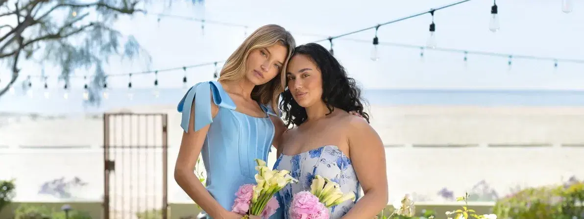
Muted colors are softened with gray, brown, or cream undertones. Think Dusty Sage, Ballet, and Champagne. These colors have a sophisticated, understated quality that feels timeless and elegant.
Saturated colors are pure, high-intensity hues like Juniper, Berry, Royal Blue, and Sunflower. These bold choices make a statement and photograph with vibrant impact when the lighting conditions are right.
Understanding this distinction matters more than you'd think. Light behaves completely differently on muted versus saturated colors, dramatically affecting how they appear in your wedding photos. But fear not. We're here to help you choose!
Summer light creates unique photography differences that can enhance or subdue your color choices. Each type of lighting condition affects colors differently, and understanding these changes helps you select the most photogenic palette.
Midday sun means bright, directional light. It lowers color saturation, enhances highlights, and creates stronger shadows on skin. Those bright colors you love may appear more neon, while those perfectly-picked pastels can lose their luster.
Golden hour—the hour before sunset—warms everything with a magical glow. This lighting boosts reds, oranges, and pinks while softening harsh edges. It's when saturated colors truly shine and look their most romantic.
Overcast conditions or shaded areas reveal color subtlety beautifully. Muted tones sing in this soft, even lighting, while bright colors can appear surprisingly dull without direct sunlight to energize them.
The practical takeaway? Your ceremony time is your biggest color photography variable—even more important than the specific colors you choose. Plan your palette around when you'll be saying "I do."
Pro Tip: The Photography Sweet Spot
Professional wedding photographers often recommend scheduling your ceremony two to three hours before sunset. You'll get warm, flattering light without the harsh shadows of midday, which makes almost any color choice photograph beautifully.
Your ceremony timing should guide your entire color strategy. Here's how different summer wedding colors perform throughout the day.
Ceremony Time | Light Quality | Best Colors | Colors to Rethink |
Morning (8 AM – 11 AM) | Cool, soft, filtered—flattering to delicate tones | Iris, Pale Yellow, Pistachio, Sky Blue | Deep jewel tones can feel too heavy for the hour |
Midday (11 AM – 3 PM) | Bright, directional, high-contrast | Dusty Blue, Dusty Sage, Terracotta, Champagne, Quartz | Pure pastels (wash out) and pure neons (read too bright) |
Golden Hour (4 PM – 7 PM) | Warm, soft, forgiving—a gift to bold color | Sunset Coral, Sunflower, Berry, True Teal, Plum | Cool pastels can look muddy in warm light |
Evening / After Sunset | Ambient and candlelight—low and warm | Wine, Marine, Evergreen, Cranberry, Amethyst | Very light pastels tend to disappear |
Morning light is cooler and softer because the sun is at a low angle, scattering through more atmosphere before it reaches your ceremony. That filtered quality is why pastels look so good in it. Iris, Pale Yellow, Pistachio, and Sky Blue all photograph beautifully in this gentle light, holding their delicacy without washing out.
Morning ceremonies also offer the advantage of cooler temperatures for your wedding party, so your bridesmaid dress colors won't compete with flushed, overheated faces in photos.
Midday isn't necessarily harsh light—it's directional light. The sun is nearly overhead, and the colors that photograph well are the ones with enough depth to absorb it rather than bounce it back at the camera. That's why medium-depth colors with rich undertones shine here: Dusty Blue, Dusty Sage, Terracotta, Champagne, and Quartz. Their gray and brown undertones soften the intensity and keep the palette looking intentional, not washed out.
Save pure pastels and highly saturated brights for other times of day—at midday, pastels tend to disappear and brights can read almost neon.
Golden hour is a gift to bold color. As the sun drops, its light travels through more atmosphere and filters out cooler wavelengths, leaving a warm glow that amplifies reds, oranges, pinks, and warm greens. This is when Sunset Coral, Sunflower, Berry, True Teal, and Plum look their most flattering—vibrant but never overwhelming.
Golden hour is also forgiving for mixed palettes, so if you're blending muted and saturated elements, this is the lighting that ties them together.
Once you're working with ambient and candlelight, rich deep colors come alive. Wine, Marine, Evergreen, Cranberry, and Amethyst create sophisticated, romantic images because they provide the contrast warm low light needs to read as dimensional rather than flat.
Your venue's environment impacts how colors photograph, sometimes even more than the time of day. Here's how to think about each setting.
Everything is already bright—sand, water, and sky create an intensely reflective environment that amplifies any color you add to it. Muted palettes keep photos from feeling oversaturated. Lean into sage, blush, sandy neutrals, and powder blue; they complement the setting rather than competing with it. If you want a pop of color, save it for the florals, not the bridesmaid dresses.
Greenery is already doing a lot of visual work, and muted greens (sage, eucalyptus) can get swallowed by a leafy backdrop. Pair them with a contrasting accent like blush, terracotta, or cream so your palette stands out in photos instead of blending in. A good rule of thumb: if 60% of the background is green, at least one of your palette colors should not be.
This is where saturated palettes can fully flex. Because you're controlling the lighting, your colors will look the same from ceremony to reception—which means bolder choices hold up beautifully across every photo. Use this freedom to choose a statement color you'd be nervous about outdoors.
The environment already skews warm and golden, so you can either lean in (corals, terracottas, warm neutrals) or contrast (cool blues, crisp whites, dusty greens). Both work. The choice is really about whether you want photos that feel cohesive with the setting or dramatic against it.
When selecting summer bridesmaid dress colors, consider how different hues interact with various skin tones under bright summer light.
Highly saturated colors can compete with warmer skin tones in direct sunlight, creating an overwhelming effect in photos. Consider shifting toward slightly muted versions—dusty rose instead of hot pink, or sage instead of bright emerald.
Muted pastels can wash out fair skin tones in bright summer sun. Anchor these soft colors with deeper accents like a darker sash, bolder lipstick, or richer bouquet colors to create definition in photos.
Mixed bridal parties photograph best in color families rather than exact-matching shades. A "dusty blue palette" lets each bridesmaid choose the specific shade that flatters her most, creating a cohesive but personalized look across the whole group.
Your wedding guests have more flexibility than your wedding party, but the same color photography principles apply with lower stakes.
The safest summer guest palette leans into medium-tone, jewel-adjacent colors: dusty jewel tones, mauve, olive, and dusty blue. These shades flatter in any lighting condition and won't clash with your carefully chosen wedding colors.
A few things guests should steer clear of: pure white (for obvious reasons), anything cream-adjacent enough to read as white in photos, and ultra-bright neons that might pop harder than the bride in group shots. Otherwise, encourage guests to choose colors that complement rather than compete with your palette.
You don't have to choose between muted and saturated. Some of the most photogenic palettes use a muted base with one or two saturated accents—giving you the sophistication of muted tones with the visual impact of brighter elements.
A few combinations that work beautifully: sage and terracotta with cream; dusty blue with marigold and ivory; champagne and blush with a single deep accent like burgundy or forest green.
Saturated florals photograph beautifully against neutral linens, while muted florals create elegant contrast against richer table settings. Metallic accents in gold or champagne warm up cool palettes; greenery cools down warm ones. Think of it as a dial you can turn in either direction depending on the mood you want your photos to hold.
Pastels can photograph beautifully in summer, but timing and styling matter. They work best in morning light or shaded areas. In bright midday sun, anchor pastels with deeper accent colors to prevent them from washing out completely.
Avoid pure neons in midday sun, as they can appear unnaturally bright. All-white palettes can be challenging on beaches due to harsh reflections. Very dark colors in full sun can absorb heat uncomfortably and create stark contrasts in photos.
Absolutely! Bold, saturated colors are stunning for summer weddings, especially during golden hour or evening ceremonies. The key is matching your color intensity to your lighting conditions for the most flattering photos.
Dusty blue, sage green, mauve, terracotta, and champagne consistently photograph well across different summer lighting conditions. These medium-depth colors with subtle undertones are forgiving and flattering. Many couples find these options readily available when shopping for bridesmaid dresses.
Three to four colors plus a neutral create the most cohesive and photographically pleasing palette. This typically includes one main color, one or two accent colors, and a neutral like cream, ivory, or champagne to balance the overall look.
There's no universally bad summer wedding color—just colors that need the right light to shine. Start with your ceremony time, work with your venue's personality, and trust colors that have depth and undertones to photograph beautifully no matter what the sun is doing. Whether your palette leans muted and refined or bold and vibrant, the right combination will hold up across every photo you take that day.
