What Color Prom Dress Actually Looks Good on You? A Real Guide by Skin Tone
Picking a prom dress colour is honestly harder than it sounds. You can love a colour in theory and then try it on under fluorescent lighting and feel totally off. The dress you saw on someone else's Instagram might land differently on your skin, and that's not a flaw in you — it's just colour science doing its thing.
This guide breaks it down by skin tone and undertone so you can walk into your search with actual direction, not just vibes.
Before anything else, figuring out your undertone saves you from a lot of dressing room confusion. Your skin tone (fair, medium, olive, deep) is how light or dark your complexion appears. Your undertone is the hue sitting beneath the surface, and it doesn't always match your depth.
A quick way to check: look at the veins on your inner wrist in natural light.
Blue or purple veins usually signal cool undertones
Green veins tend to mean warm undertones
A mix of both points to neutral undertones
Another quick check: hold a plain white piece of fabric and then a cream or off-white one up to your bare face in natural light. If the stark white makes your skin look clearer and more awake, you're likely cool-toned. If the cream feels more natural and less harsh, you're probably warm. If neither looks obviously better, neutral is a fair call — and it gives you the most range when shopping.
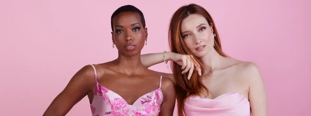
Pastels often get pushed on fair-skinned people, but the real standouts are colours with some depth to them. Periwinkle is having a major 2026 moment, and it photographs particularly well on cool fair skin — there's enough blue in it to complement without washing out. Icy lavender, soft rose, and dusty mauve work in the same family.
If you want something bold, jewel tones are your best bet. Sapphire blue, emerald green, and deep amethyst give fair skin contrast and make photos pop. These colours look especially vibrant under venue lighting.
Colours that can be tricky: nudes and beiges in the same value as your skin tend to flatten, especially in photos. If you love that barely-there palette, go warmer than your skin tone or add dimension with fabric texture.
Warm fair skin — think golden, peachy, or ivory base — tends to look alive in butter yellow, peach coral, warm gold, and rust-tinged terra cotta. These colours pull out the warmth in your complexion instead of fighting it.
Butter yellow in particular is one of 2026's standout prom colours and genuinely works well on warm fair skin. It photographs softly in natural light and feels fresh without being loud.
Avoid very cool-toned shades like icy blue or stark white — they can make warm fair skin read as sallow in photos.
Medium skin tones have a lot of range — from warm honey to neutral beige to cool rose-beige — but generally sit in a sweet spot where both warm and cool colours can work depending on undertone.
Emerald green is genuinely one of the most flattering colours for medium warm skin. It's not just a trend call — the contrast between green and warm undertones creates a really clean visual. Coral, burnt orange, deep gold, and rich terracotta all land well here too.
Gold metallics — liquid or matte — are a natural fit. They photograph brilliantly under both flash and amber venue lighting, which means your pictures look as good as you feel in person.
Cool-toned medium skin responds well to fuchsia, deep rose, cobalt blue, and cool lilac. Fuchsia specifically is a strong 2026 prom colour that tends to show up intensely on camera without needing any editing — it holds its colour even under harsh overhead lights.
Jewel tones across the board — sapphire, amethyst, teal — give cool medium skin a polished, high-contrast look that reads well in both candid and posed photos.
Olive skin is warm-neutral, which means it has both green and yellow undertones that can react in unexpected ways to certain colours. Very yellow-based shades can sometimes bring out the green in olive skin in a way that feels off. What tends to work better:
Deep jewel tones are consistently flattering — forest green, wine, royal blue, burnt sienna. These sit far enough from the skin's natural undertones to create definition without clashing.
Emerald green works beautifully on olive skin, particularly in richer, darker shades rather than bright kelly green. The depth in the colour complements rather than competes.
Fuchsia and hot pink hit differently on olive skin than on fairer complexions — there's a warmth to the contrast that photographs really well. If you've been hesitant about pink, this might be the skin tone where it makes the most visual sense.
Metallics — gold, copper, bronze — are natural fits for olive undertones. They enhance the warmth in the skin instead of fighting it.
Colours that can be harder: very pale pastels, neons, and yellows that are too similar in warmth to olive undertones. If you want yellow, go for a richer mustard or amber gold over a pale butter tone.
Deep and dark brown skin tones have incredible range when it comes to colour — almost every colour family has a version that works, but the saturation and depth of the shade matters a lot.
Rich jewel tones are a strong go-to: deep cobalt, emerald, wine, burgundy, and royal purple all create beautiful contrast without competing. These colours hold in photos under all kinds of lighting.
Metallics are genuinely stunning on deep skin — gold, bronze, liquid silver, and champagne have a visual relationship with deeper complexions that's hard to replicate on other skin tones. If you want a dress that photographs like it has its own light source, metallics on dark skin do that.
Bright and bold saturated colours — fuchsia, electric blue, cobalt, true red — show up vividly against deep skin in a way that makes photos feel editorial rather than just cute. These aren't risky choices; they're often the ones that get the most compliments on the night.
Butter yellow can be beautiful on dark skin — look for versions with warmth in them (golden butter, not icy lemon) and enough saturation to stand against the skin's depth.
White and ivory work well when the shade has warmth to it or the dress has enough dimension in the fabric (texture, beading, embroidery). A flat matte white can read stark in some lighting, but a textured or embellished white photographs really well.
This matters because your prom pictures will exist forever, and what looks good in a dressing room mirror can look completely different under venue uplighting, iPhone flash, or professional photographer lighting. If you want to plan ahead, our most photogenic prom dress silhouettes guide is worth a look.
High-contrast colours tend to photograph best. A colour that creates visual contrast against your skin tone — rather than blending into it — gives the camera something to work with. This is why jewel tones consistently produce great photos across skin tones.
Flash photography can blow out pale pastels and make them appear almost white. If the photos are important to you and you want to wear a pastel, look for ones with enough saturation to survive exposure. Dusty rose will hold better than icy pink.
Venue lighting is usually warm and amber. Colours in the warm family — golds, corals, warm reds, warm neutrals — tend to look natural and rich under this kind of light. Cool colours like icy blue or lavender can sometimes look a bit washed under amber light, though they recover beautifully under natural and flash photography.
Metallics are consistent performers under all lighting conditions. Gold looks warm and dimensional under venue lighting, crisp and editorial under flash, and natural in daylight. It's one of the safest bets if you want photos that look great no matter what.
Fuchsia and deep red are among the most photogenic colours overall — they hold saturation in almost every lighting scenario and create strong visual contrast that reads well in group photos.
Yes, with some nuance. Butter yellow is one of the season's most worn colours, and it genuinely works across skin tones — but the specific shade matters.
Fair cool skin: look for butter yellow with a slight cream or pink undertone rather than pure warm gold. This keeps it from overwhelming.
Fair warm skin: most butter yellows work well here. The warmth in the colour complements the warmth in your complexion.
Medium and olive skin: yellow can be tricky if your olive undertones are strong. A deeper, more golden-butter rather than a pale lemon tends to read better.
Deep skin: go for butter yellow with saturation — something with gold depth to it rather than a pale, washed version.
The cut and fabric of the dress also play into how the colour reads. Satin butter yellow has more visual weight than chiffon butter yellow, which can feel almost white in photos.
It's close to universal, but shade and saturation matter. True emerald — that rich, jewel-toned green with a balanced warm-cool base — tends to work across most complexions because it's saturated enough to create contrast without being too warm or too cool.
Where it can be tricky: very fair cool skin can sometimes feel competed with by a very bold emerald. In that case, a slightly deeper or jewel-toned version (think forest emerald rather than bright emerald) works better. For olive skin, a deeper emerald is stronger than a brighter kelly green, which can pull out yellow tones.
Across medium, warm, and deep complexions, emerald green is consistently one of the most reliable prom colours going.
Periwinkle — blue-violet, cool-toned, works especially well on fair and medium cool skin
Emerald green — deep jewel tone, widely flattering across skin tones
Fuchsia — high-saturation pink, bold and photogenic, great on medium to deep skin
Butter yellow — warm, soft, trending in satin and chiffon silhouettes
Liquid silver and metallics — gold, bronze, champagne, silver — consistent performers under all lighting
These colours look best when the shade is matched to undertone rather than just applied generally. The same colour family in a warmer or cooler version can read completely differently on different complexions.
Can I book an appointment to see colours in person at David's Bridal? Yes — we offer free styling sessions both in-store and virtually. In-store appointments let you see colours against your actual skin under real lighting, which is genuinely hard to replicate on a screen. You can book your appointment here.
Does David's Bridal offer a loyalty or savings program? Our Diamond Loyalty program is free to join and gives you an extra 5% off every day, both in stores and online.
How do I choose between two colours I like equally? Bring both into consideration alongside your venue. If your prom is in a ballroom with warm amber lighting, the warmer of the two colours will likely photograph better. If you'll be outdoors or in a space with natural light, either tends to work. Also consider which colour you'd want to remember wearing — practicality matters, but so does the one that felt right when you looked in the mirror. For more on prep, our prom photoshoot readiness checklist is a handy reference.
What if my skin tone is between two categories? Most people don't fit neatly into one box. If you're between fair and medium, or medium and olive, look at the undertone guidance rather than the depth category. Undertone is usually the more decisive factor in whether a colour works.
Is there a colour that's genuinely bad for all skin tones? Not really — there are shades that are harder to work with (very muted or ashy neutrals that are too close to skin depth can flatten anyone), but most colour families have a version that works. The key is the right shade within the family, not avoiding the colour entirely.
What should I consider about the dress silhouette alongside colour? Lighter, softer colours tend to feel less structured, so they often work well with flowy or draped silhouettes. Jewel tones and metallics have enough visual weight to carry more structured or embellished designs. That said, colour and silhouette are separate decisions — find the colour that feels right first, then let the silhouette follow. Our guide on how to style a colored prom dress can help with the rest.


