How Do I Coordinate Prom Dress Colors with My Date or Group?
You've found the dress. It fits, it photographs well, you feel good in it. Now comes the group chat spiral: "What color is everyone wearing?" followed by seventeen screenshots and a poll that somehow makes things more confusing.
Coordinating prom looks doesn't need to feel like solving a puzzle where half the pieces are missing. Whether you're going with a date, rolling with your friends, or somewhere in between, the goal isn't perfection. It's showing up feeling like yourself, getting photos you'll actually want to look at later, and not stressing about whether someone else's blue clashes with your blue.
Here's what actually works.
Matching used to mean identical colors, down to the exact shade of purple. That's changed. Most people now aim for coordinated, not matchy-matchy, because it looks better in photos and gives everyone room to wear what they actually like.
Coordinated means:
Your date's tie or pocket square pulls from a color in your dress (not necessarily the main color)
Your group uses a shared palette but different shades or styles
There's visual connection without looking like you're in uniform
Exactly matched means:
Same color, same intensity
Often requires bringing fabric swatches to formalwear stores
Can feel restrictive if someone finds their dream dress in a different shade
Most couples land somewhere in the middle. If your dress has multiple colors, embroidery, or prints, your date can match to an accent rather than the base. A emerald dress with gold beading? Gold tie. A floral print? Pull any color from the pattern.
Start with your dress. Seriously. Whoever finds their outfit first sets the direction, and prom dresses typically take longer to shop for than suits or tuxes.
Once you know your color, share a photo in good lighting. Not a screenshot of a screenshot, an actual clear image. If you ordered online, wait until it arrives to confirm the real-life color, screens lie.
For your date's formalwear:
Tie, bow tie, or pocket square in your dress color or a complementary shade
Vest or cummerbund if they want more color
Neutral suit (black, navy, gray, tan) works with everything
Complementary doesn't mean complicated. If you're wearing red, they could do black with a red tie. If you're in blush pink, they could do navy with a blush pocket square. You're creating a visual link, not trying to become a two-person color wheel demonstration.
At David's Bridal, we carry men's formal accessories that make coordination simple, and you can browse prom dresses in every color to start planning your palette.
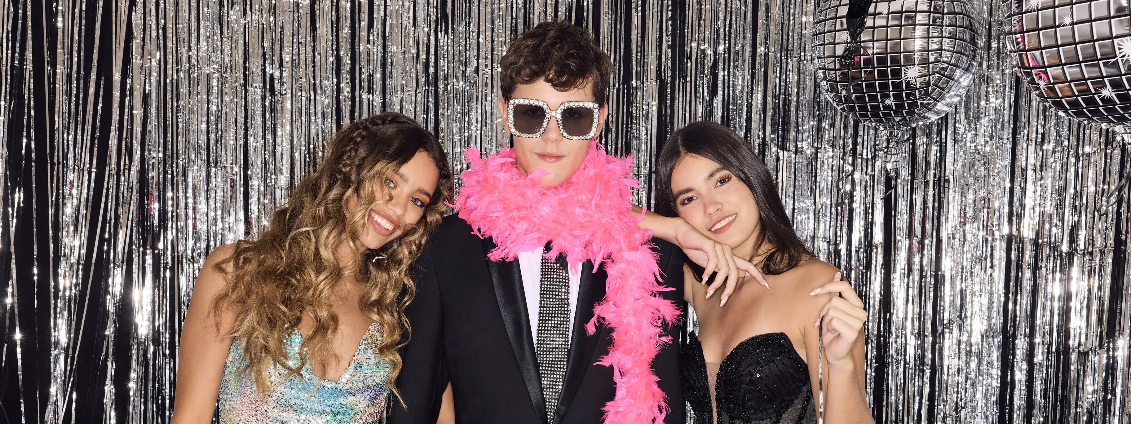
The group photo matters. You'll be standing in a line at some point, probably in someone's backyard before dinner, and you want it to look intentional but not staged.
Three ways groups typically coordinate:
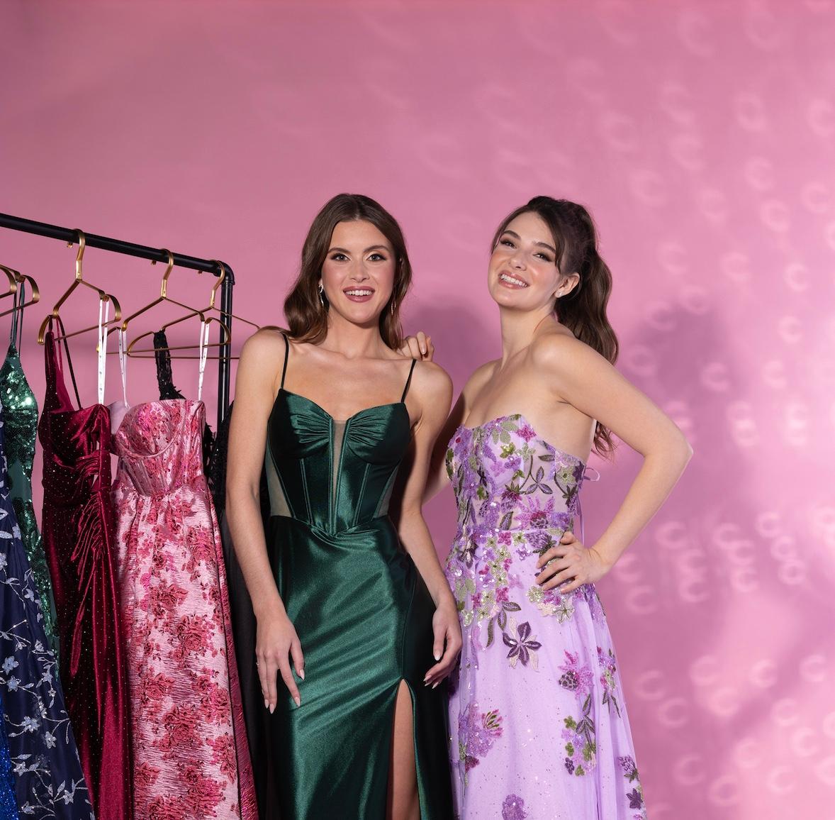
Same color family, different shades: Everyone wears blue, ranging from powder to navy. Creates cohesion without repetition.
Complementary palette: Jewel tones together (emerald, sapphire, ruby), pastels together (lilac, mint, peach), or neutrals with one pop color.
Planned chaos: Everyone picks what they want, but you avoid direct clashes by sharing choices ahead of time. No two reds, no neon next to soft romantic tulle.
The group chat exists for a reason. Use it. Drop photos as you shop, flag potential overlaps before anyone's already ordered, and be honest if someone's choice doesn't work with the vibe you discussed.
If someone finds a dress they love that's outside the plan, the group adjusts. Prom matters more than a color scheme, and forcing someone into a dress they don't want shows in every photo.
Your phone camera and the hired photographer see color differently than your eyes do. Some combinations blend into mud, others create contrast that makes everyone look sharp.
Combinations that consistently work in photos:
Jewel tones together (rich, saturated, similar intensity)
Neutrals (black, white, champagne, nude) with one or two brights
Monochrome with texture variation (all black but different fabrics)
Warm tones together or cool tones together, not mixed
Combinations that can get tricky:
Pastels next to neons (the contrast fights for attention)
Multiple bright colors at the same saturation (looks chaotic)
Very light colors on everyone (washes out in bright light)
Lighting matters more than most people realize. Golden hour, indoor tungsten, flash, they all shift how colors appear. Jewel tones and deeper shades tend to be more forgiving across different lighting than very pale or very bright colors.
If you're worried, test it. Take a photo of everyone's dress options laid out together. If it looks good on your phone, it'll probably work in person.
No. Silhouette diversity actually makes group photos more interesting.
Think about it: a line of identical A-line gowns reads as prom court, not friend group. Mix a ballgown with a fitted mermaid and a flowy two-piece, keep the color coordinated, and suddenly you have dimension.
What creates visual harmony:
Shared color story
Similar level of formality (all full-length gowns or all short, not mixed unless intentional)
Coordinated metallic accents (all gold jewelry or all silver)
What doesn't matter as much as you think:
Neckline styles
Sleeve length
Embellishment type
If you're browsing, David's Bridal has long homecoming dresses that work for prom and come in sizes 0–30, so everyone can find their silhouette in coordinating colors. Our under $150 section also makes it easier to stay in budget while keeping the group look cohesive.
Totally fine if you're both fine with it. Not fine if it's going to bother you every time you see photos.
Have the conversation early. "I'm planning to wear emerald, are you good with us both in green or would you rather pick something else?" Direct, simple, no weirdness.
If you both want the same color, differentiate with style. One person does a fitted column gown, the other does a ballgown with a full skirt. Different silhouettes in the same color look intentional, not repetitive.
Or, one person does the color in a solid, the other in a print or with embellishment. A solid burgundy next to a burgundy floral reads as coordinated, not copied.
Someone's dress doesn't fit. A shipment is delayed. The color looks completely different in person. It happens.
If your dress changes:
Let your date and group know immediately. Send the new photo. Most formalwear can be adjusted quickly if needed, especially accessories.
If your date's outfit changes:
Decide if it matters. A slightly different shade of blue than planned won't ruin your night. A completely different color might need a quick trip to swap a tie.
If someone in the group changes:
Communicate. If the new dress still works with the palette, move forward. If it clashes, figure out if they can find an alternative or if the group adjusts around them.
David's Bridal offers standard shipping within 3–4 days and an optional 48-hour rush. You can also find ready-to-ship styles on our website if you're down to the wire. And if you need alterations, we offer those services in-store to get the fit right fast.
Only if they want to come and you want their opinion. This isn't required.
Some people love shopping together. Others find it stressful or boring. Be honest about what you need. If you want their input, bring them. If you'd rather decide solo and just share the final choice, do that.
If you do shop together:
Go during off-peak hours so you're not rushing
Know your budget ahead of time
Be open to their feedback but clear about what's non-negotiable for you
If you shop separately:
Share photos in real time if you want feedback
Confirm colors before ordering
Trust that they know what works for them
You can also book a free styling session at David's Bridal, in-store or virtual. Having a stylist help navigate color coordination takes pressure off both of you.
They don't need to match the dress exactly. Metallic neutrals (gold, silver, rose gold) work with almost everything. Nude or black are safe. Colored shoes can work if they pull from an accent in your dress.
For accessories:
Jewelry in one metal tone looks more cohesive than mixing metals
If your dress has embellishment, keep jewelry simple
Your date's accessories (watch, cufflinks, tie bar) don't need to match yours, just shouldn't clash
Coordination extends to the details but doesn't need to be obsessive. The goal is looking put-together, not color-coded.
Honestly? Less than it feels like right now.
In ten years, you'll remember how you felt, who you went with, and whether you had fun. You probably won't remember if your date's tie was the exact right shade of lavender or if someone in the group wore navy instead of royal blue.
That said, caring about photos isn't shallow. You're documenting a moment, and wanting it to look good is normal. Just keep perspective. Coordination should make things easier (clear group aesthetic, simplified decisions), not harder (stress spirals, friendship tension, last-minute panic).
If everyone feels good in what they're wearing and the colors don't actively fight each other, you've succeeded.
Color coordination works best when everyone communicates early, stays flexible, and remembers the actual point of prom: showing up, having a night worth remembering, and getting photos that don't make you cringe.
Explore the full collection at davidsbridal.com and find what works for you and your crew.


